Red Arc
Brand Story Development, Logo Refresh, Customer Experience Design
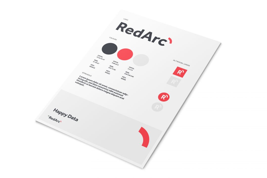
Red Arc was building their brand presence in the not for profit sector but felt that their visual identity was not representative of their brand story.
Red Arc wanted to differentiate through their customer experience, while taking a clear positioning around ease. As a result, a brand story was built around the name Red Arc and a very simple, iconic logo developed with significantly greater recall.
Their work continues on the development of their client facing tools.
CLIENT:
Red Arc
PROJECT:
Logo Design